… updated on Monday, October 13, 2025 09:17 +0200
Changing the Layout of netlab Topology Graphs
After I published the updated netlab topology graphs article, Samuel K. Lam quickly made a comment along the lines of now we know how the graph representing the following topology was made, adding a nice ASCII art that illustrated the point I was trying to make much better than my graphs:
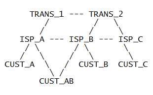
ASCII art representing the BGP leak lab
Let’s see how close we can get to that ideal topology diagram with GraphViz and D2 graphs.
Here’s the GraphViz lab topology diagram created from the original lab topology:
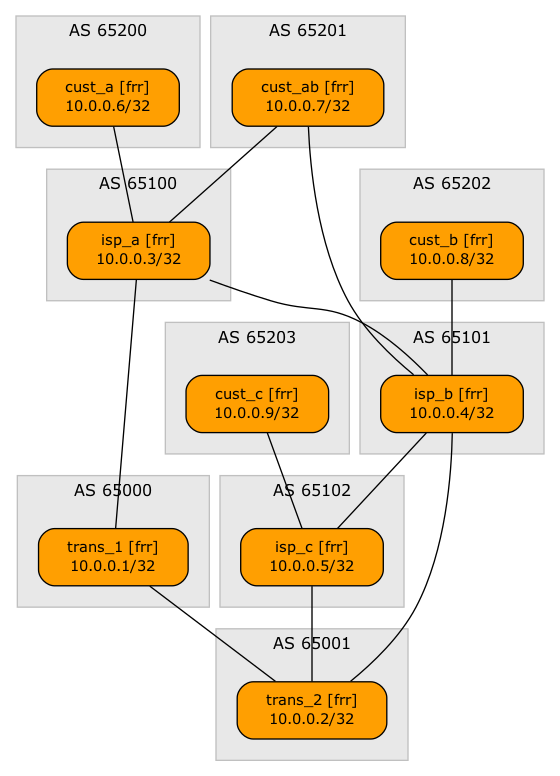
GraphViz graph created from the original lab topology
The graph could help you understand the network topology1, but it’s all wrong from the perspective of what matters. The transit ISPs should be at the top, followed by access ISPs and customers. Welcome to the wonderful world of auto-placement algorithms.
GraphViz and D2 do a pretty good job placing graph elements on a page, but they can’t possibly know what matters to you. They use two clues to figure out which graph elements should be placed first (in the top-left corner):
- The order of nodes listed in the graph description file. All else being equal, nodes defined earlier have a better chance of getting closer to the top-left corner than other nodes2.
- The order of nodes in edge definitions. If the graph description has an “A-B” edge, A has a better chance of being in the top-left corner than if the graph has a “B-A” edge.
netlab creates topology graph description files straight from the lab topology:
- The order of nodes in the graph description file is the same as the order of nodes keys – usually the order in which you list your devices in the nodes dictionary (Python preserves key ordering) unless you use auto-create groups.
- The order of interfaces in the elements of the links list – the order in which you list the nodes in a link dictionary, the order in which you specify them in the interfaces list, or the order in which the nodes are listed in a string describing a link (more details).
After this brief detour into how things work, let’s look at the BGP leak lab topology file. Every single link has the node that should be lower in the diagram listed first, for example:
- cust_a:
    bgp.role: customer
  isp_a:
    bgp.role: provider
    bgp.locpref: 200
- cust_ab:
    bgp.role: customer
  isp_a:
    bgp.locpref: 200
    bgp.role: provider
No wonder the customers are placed at the top of the diagram. Let’s change the order of nodes in link definitions. The above links would become (the whole topology file is on GitHub):
- isp_a:
    bgp.role: provider
    bgp.locpref: 200
  cust_a:
    bgp.role: customer
- isp_a:
    bgp.locpref: 200
    bgp.role: provider
  cust_ab:
    bgp.role: customer
Not surprisingly, the diagram generated from that topology file is closer to what we want to have:
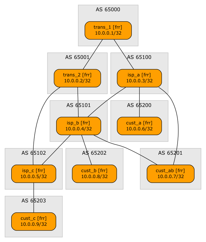
GraphViz graph created from the original lab topology
Can we get any closer to our goal? I couldn’t find a way to nudge GraphViz in the right direction. Ultimately, I gave up and added GraphViz rank directives to the graph.dot file:
graph {
  newrank=true;
...
 { rank=same; trans_1; trans_2 }
 { rank=same; isp_a; isp_b; isp_c; }
}
The result is probably as close as one can get to an ideal diagram with an auto-placement tool and a few hints and nudges:
Using GraphViz ranks to create layers of autonomous systems
However, wouldn’t it be nice if we didn’t have to tweak the graph.dot file? Couldn’t netlab provide that functionality? Glad you asked (or at least got to here 😉).
We added the graph.rank attribute in netlab release 25.10. Here’s how you could use it to generate an almost-perfect graph without rearranging the links (complete topology file):
groups:
  transit:
    members: [ trans_1, trans_2 ]
    graph.rank: 1
  access:
    members: [ isp_a, isp_b, isp_c ]
    graph.rank: 2
The graph.rank node attribute does two things:
- It generates the rank=same directives in the GraphViz graph description file.
- It rearranges the order of nodes in edge (link) descriptions (this works for GraphViz and D2 graph descriptions).
Kicking The (Free) Tires
Want to try out these examples? Use the procedure I described in the Changing Colors and Line Styles in netlab Graphs blog post using the examples from the BGP/Route-Leaks directory.
Revision History
- 2025-10-13
- The graph.rank node attribute is implemented in release 25.10
-
At least it would do a better job than some of the hand-drawn graphs I’ve seen in the early days of telekoms trying to become ISPs. In one of the meetings, someone literally pulled the heavily folded network diagram out of his back pocket. I’m pretty sure that was the only copy of the network topology of that particular (pretty large) ISP wannabe. ↩︎
-
Using the default top-left-to-bottom-right placing algorithm. Both tools have a nerd knob that can be used to place the nodes in the left-to-right direction (example) ↩︎