Create IP Multicast Tree Graphs from Operational Data
A while ago I created an Ansible playbook that creates network diagrams from LLDP information. Ben Roberts, a student in my Building Network Automation Solutions online course used those ideas to create an awesome solution: he’s graphing multicast trees.
Here’s how he described his solution:
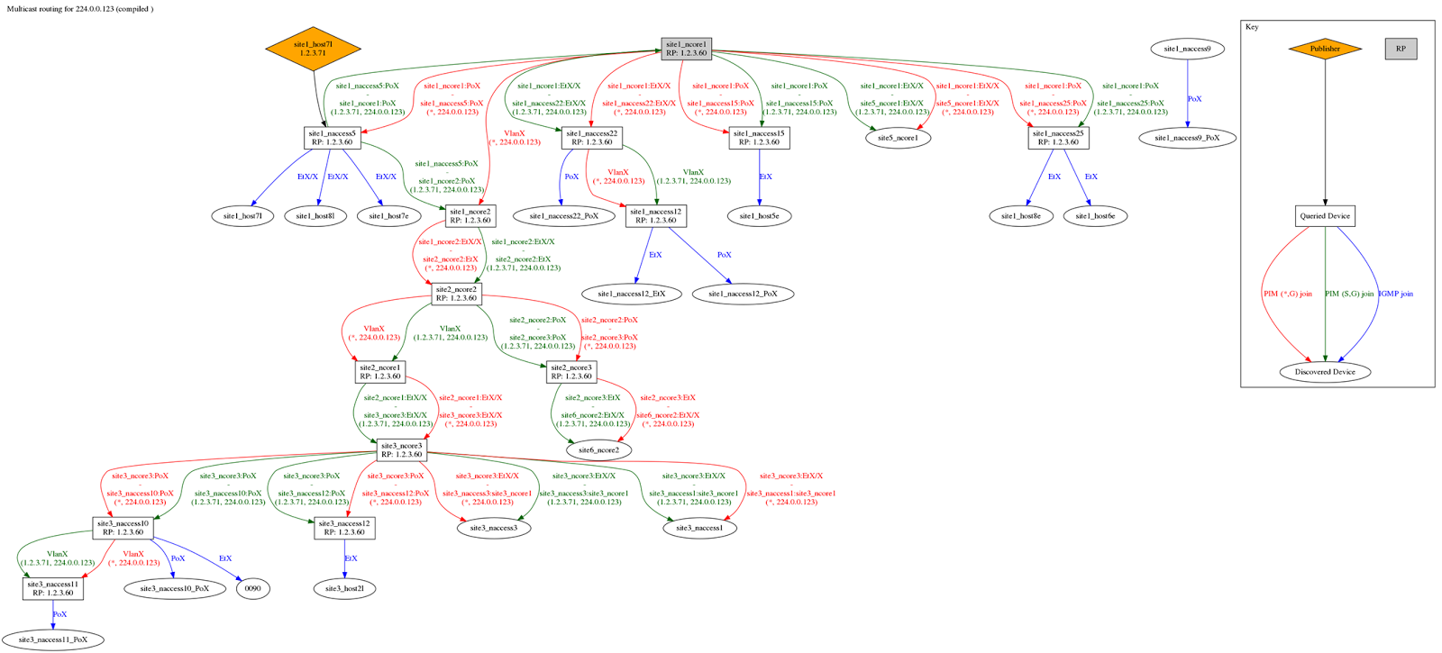
Wrote an Ansible playbook that creates a visual representation of the shared and source-specific PIM trees, and IGMP snooping for a single multicast group across a chunk of the network.
Data is scraped from switches using ntc_show_command and some custom textfsm scripts. Ansible does the scraping of data and writes out intermediate yaml files per host, then compiles them all into a single document. Then it generates a dot file using a jinja2 template, in which I'm abusing filters to do all the business logic in python.
Now when an $end_user complains that they're having problems with a particular group, we can kick off this job (which takes a couple mins to fetch all the data, and then a few seconds to graph it) to work out where the flow is coming from and being subscribed to ;)
The source code for Ben's solution is in his GitHub repository.
I’ve seen plenty of network management systems that can draw network diagrams, there might be some that can draw how a particular VLAN looks like, but I’ve never seen something that could do it for a multicast tree – another proof how useful read-only automation can be in your network.
Want to learn how to do something similarly cool? Join the Building Network Automation Solutions online course!
4 comments: